
Apprie
I worked with participants in the 2021 humanitarian hackathon to design a tool with a scientific approach in combining sensory information and metrics from the user with available medical knowledge to make accurate diagnostics and decisions about personalized treatments and adjustments.
The project evolved into a startup idea. An AI tool provides information through networking, research, and data users can track to save money and time when dealing with unique conditions where symptoms may be overlapping. It would give access to more types of treatments and options to choose from and a transparent communication with their doctors.
My role as a lead UX designer was to manage design, design strategy, branding, and research.
Tools Used:
Sketching, Photoshop, Figma, FigJam, Canva, Maze, Cursor
Team Size - 4
2024 - Present
Startup
Role - UX Lead

What are the goals?
Mission
Our mission is to provide tools and support that enable individuals to take control of their care and potentially alter the course of their conditions.
Vission
To revolutionize healthcare by bridging gaps in care and empowering patients to transform their health outcomes through seamless documentation and personalized support
Key Features
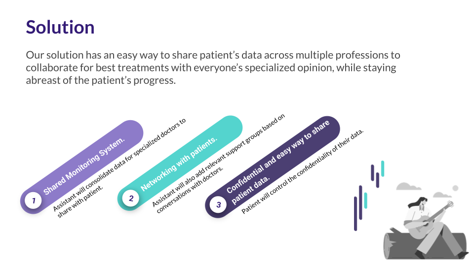
- AI-powered Assistant for seamless communication between patients and doctors, improving care coordination.
- Health Discovery Platform connecting patients to clinical trials, pharmaceutical innovations, and behavioral interventions.
- Streamlined Electronic Medical Records (EMR) to simplify billing processes and reduce administrative burdens, allowing doctors to focus more on patient care.
- Secure, Decentralized Record-Keeping ensuring the safety and privacy of medical data
Who is our audience?
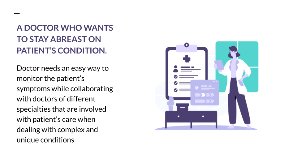
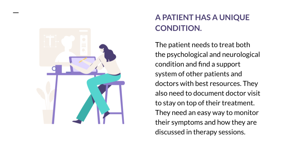
Personas guided the team to reflect on the unique needs of patients and doctors when tracking symptoms and treatments. When we looked into patient personas, it showed us that they faced challenges like coordinating complex regimens, monitoring fluctuating symptoms, and balancing emotional and practical hurdles. Doctor personas emphasized time constraints, rapid-entry flow of data, and the importance of definitive, actionable insights. Together, these perspectives enabled solutions that enhanced visibility into patient progress and facilitated clearer, more transparent communication between patients and clinicians.


What are the pain points?
Pain point analysis was crucial in identifying the most important features of a technical solution to address the challenges and frustrations patients and doctors may have throughout the process of finding and monitoring their treatments. Examining the integration with existing systems—the team was able to pinpoint areas that required immediate attention and improvement. Pain point analysis also helped to empathize with users and understand their journey through the process.

What are the scenarios and potential solutions?
User stories were useful to brainstorm technical solutions which would actually help the users. Staying tuned into the user experience as they describe each requirement helped ensure the focus on real-world needs, as “As a doctor, I need to quickly access patient histories so I can make informed decisions.” This concept facilitated communication between the team and a high level of creativity so that they could create not only technically competent solutions but also functional and important based ones which would contribute to the users satisfaction.
User stories inspired more intuitive ideas by allowing the team to put themselves in user's shoes and view their scenario from different angles. Our team brainstormed some of the most common user stories to set a context for the Apprie application and pain points we wanted to address. Here are some user stories we brainstormed and solutions we came up with and their possible solutions:
Monitoring Symptoms
Monitoring symptoms with doctor access to evaluate progress and make suggestions for treatment. This is also a way to educate patients about their symptoms using AI resources and symptom analysis with visuals of the anatomy and systems affected.
How do we differentiate ourselves?
Goal of the competitive analysis was to evaluate the impact of existing apps in the industry to decide and determine if it meets users' expectations for finding information relevant to this topic.


Let's ideate!
For ideation we did several studies.
We started with mind mapping to understand the thinking process when using the four main features of the app - treatment monitoring, symptom monitoring, designing their space, medication management, looking for resources, and support groups. It gave us a good idea of the user's mindset and questions they may have.
Next was sketching up ideas. I used sketching as a dynamic tool to ideate and produce layouts for the main mobile components of the app. By using sketches as a starting point, we were able to align on key design elements early in the process, ensuring that the final components were user-friendly and met the app’s core objectives.


What is MVP?
The affinity diagram is great for categorizing and prioritizing features, sorting the ideas and insights in an easy way using a scale from most to least important for user stories and feedback about the personas to categorize the most important into an MVP group. This helped narrow down the key features which were most critical and aligned with user and project goals. The team were then able to cluster related features according to their interdependencies to prioritize those that would have the biggest impact in terms of the most critical sections of the solution. The affinity diagram brought clarity and alignment that informed the team's decisions as to feature development and implementation.

What are the users' paths?
User flow gave us an idea of how the app would work, and how the users would complete tasks using the steps.

Does our audience understand our product?
Field/Guerrilla Testing
Rather than validating polished assumptions, the team focused on early-stage concept validation, ensuring the solution addressed a real problem, communicated its purpose quickly, and delivered meaningful value without overwhelming users. This approach allowed insights to inform not only interface improvements, but also broader decisions around content strategy, personalization, privacy, and product direction.
The testing objectives focused on:
- Evaluating whether the problem and solution were immediately understood
- Assessing clarity of information and content relevance
- Identifying friction points in navigation and workflows
- Understanding perceptions of personalization, privacy, and trust
- Validating whether the experience met modern expectations for digital healthcare tools


Impact on Design Direction
These insights directly shaped product and design decisions moving forward. Instead of reducing functionality, the team focused on:
- Improving information hierarchy and visual clarity
- Introducing progressive disclosure to reduce cognitive load.
- Enabling personalization to tailor the experience to individual needs.
- Personalization emerged as a key expectation, with users wanting control over layout, content density, and prioritization.
What is the story behind our brand?
For branding guidelines we brainstormed and ideated on several options for logo, typography, aesthetic patterns and brand story and language.
Hi Fidelity Prototype
Hi-fidelity prototype testing plays a crucial role in the UX design process by providing designers with a clear and interactive representation of the final product. During our testing, we revisited the user flow and layout based on feedback. Below id the first version of hi-fi prototype, followed by edited version.
How can we reduce cognitive load?
The usability testing provided us with key insights about the user experience issues in the original dashboard design. Users reported difficulty in navigating a cluttered interface and complained about unnecessary complexity in features that were not essential to their daily tasks. This feedback highlighted the need to simplify both the content of the dashboard and the UI to be more intuitive and user-friendly. Moreover, a feature that would allow users to take charge of its layout and customize the interface to suit their individual needs and preferences became desirable as well. Through integrating these insights, we are proposing a streamlined dashboard that is highly customizable, enabling users to refine their experience with the ultimate goal of enhancing usability and satisfaction.

Future Considerations for Safe Expansion & Clinical Integration
To protect sensitive health-related concepts, extended access to this case study is available upon request. Please email me to receive credentials and view the wearable-driven AI concept for therapeutic guidance in trauma-induced psychogenic non-epileptic seizures (PNES).
Key Takeaways
“If I am dealing with a chronic illness or a condition that is unique to me, I want to know as much as I can, but not get overwhelmed.”
“It's a nice way to consolidate discussion about health into a visual template of a dashboard with the information the patient wants to regularly check, including support groups, resources, nutrition, medication... and doctors.”
-
simplifying medical terms is crucial when managing a user’s health, as it increases understanding, engagement, and trust.
-
Patients find the application more trustworthy if they can customize their dashboards, reducing anxiety, and saving time.